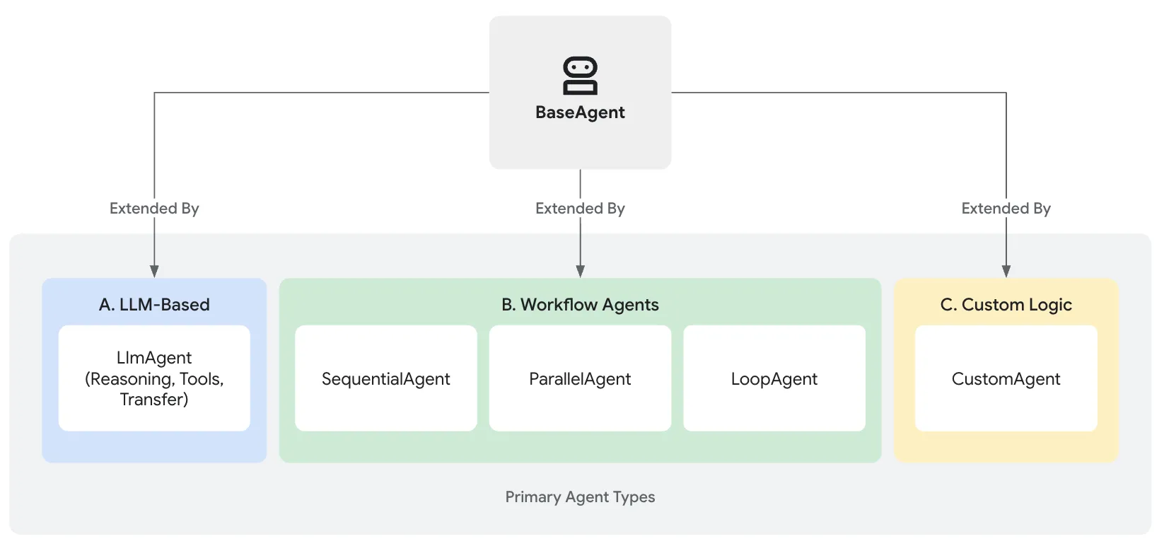
- LLM Agents handle intelligent, language-based task execution.
- Workflow Agents manage the overall process flow using standard patterns.
- Custom Agents provide specialized capabilities or rules needed for unique integrations.
Table of contents
Open Table of contents
Core Agent Categories
LLM Agents (LlmAgent, Agent)
These agents utilize Large Language Models (LLMs) as their core engine to understand natural language, reason, plan, generate responses, and dynamically decide how to proceed or which tools to use, making them ideal for flexible, language-centric tasks.
Agent Defining
- name (Required): Choose a descriptive name that reflects the agent’s function (e.g., customer_support_router, spanish_translator_agent). Avoid reserved names like user.
- description (Optional, Recommended for Multi-Agent): This description is primarily used by other LLM agents to determine if they should route a task to this agent. Make it specific enough to differentiate it from peers (e.g., Extract calendar events from text)
- model (Required): The choice of model impacts the agent’s capabilities, cost, and performance. This is a string identifier like “gemini-2.0-flash”.
- Instructions (Required): This is a string template for shapping an LllmAgent’s behavior and explain its core task,, personality, how and whzn use its tools
- Tools (Optional): They allow the agent to interact with the outside world, perform calculations, fetch real-time data, or execute specific actions.
- Fine-Tuning LLM Generation (generate_content_config)(Optional): Control parameters like temperature (randomness), max_output_tokens (response length), top_p, top_k, and safety settings.
- Structuring Data (input_schema, output_schema, output_key)(Optional): Define a schema representing the expected input/output structure.
- Managing Context (include_contents) (Optional): Control whether the agent receives the prior conversation history. if it is none the agent receive no prior contents.
- Planner (Optional): Assign a BasePlanner instance to enable multi-step reasoning and planning before execution. There are two main planners:
# Define a tool function
def get_capital_city(country: str) -> str:
  """Retrieves the capital city for a given country."""
  # Replace with actual logic (e.g., API call, database lookup)
  capitals = {"france": "Paris", "japan": "Tokyo", "canada": "Ottawa"}
  return capitals.get(country.lower(), f"Sorry, I don't know the capital of {country}.")

# Add the tool to the agent
capital_agent = LlmAgent(
    model="gemini-2.0-flash",
    name="capital_agent",
    description="Answers user questions about the capital city of a given country.",
    instruction="""You are an agent that provides the capital city of a country... (previous instruction text)""",
    tools=[get_capital_city],
    include_contents='none'
)
src/content.config.ts
Workflow Agents (SequentialAgent, ParallelAgent, LoopAgent)
These specialized agents control the execution flow of other agents in predefined, deterministic patterns (sequence, parallel, or loop) without using an LLM for the flow control itself, perfect for structured processes needing predictable execution.
Custom Agents
Created by extending BaseAgent directly, these agents allow you to implement unique operational logic, specific control flows, or specialized integrations not covered by the standard types, catering to highly tailored application requirements
| Feature | LLM Agent (LlmAgent) | Workflow Agent | Custom Agent (BaseAgent subclass) |
|---|---|---|---|
| Primary Function | Reasoning, Generation, Tool Use | Controlling Agent Execution Flow | Implementing Unique Logic/Integrations |
| Implementing Unique Logic/Integrations | Large Language Model (LLM) | Predefined Logic (Sequence, Parallel, Loop) | Custom Code |
| Determinism | Non-deterministic (Flexible) | Deterministic (Predictable) | Can be either, based on implementation |
| Primary Use | Language tasks, Dynamic decisions | Structured processes, Orchestration | Tailored requirements, Specific workflows |
| Table: High-Level Comparison Between The Agent Types | |||
Simple script tag
You should now have a script tag that looks like this:
<script
  src="https://giscus.app/client.js"
  data-repo="[ENTER REPO HERE]"
  data-repo-id="[ENTER REPO ID HERE]"
  data-category="[ENTER CATEGORY NAME HERE]"
  data-category-id="[ENTER CATEGORY ID HERE]"
  data-mapping="pathname"
  data-strict="0"
  data-reactions-enabled="1"
  data-emit-metadata="0"
  data-input-position="bottom"
  data-theme="preferred_color_scheme"
  data-lang="en"
  crossorigin="anonymous"
  async
></script>
Simply add that to the source code of the site. Most likely, if you’re using AstroPaper and want to enable comments on posts, navigate to PostDetails.astro and paste it into the desired location where you want the comments to appear, perhaps underneath the Share this post on: buttons.
<Layout {...layoutProps}>
  <main>
    <ShareLinks />

    <script
      src="https://giscus.app/client.js"
      data-repo="[ENTER REPO HERE]"
      data-repo-id="[ENTER REPO ID HERE]"
      data-category="[ENTER CATEGORY NAME HERE]"
      data-category-id="[ENTER CATEGORY ID HERE]"></script>
  </main>
  <Footer />
</Layout>src/layouts/PostDetails.astro
And it’s done! You have successfully integrated comments in AstroPaper!
React component with light/dark theme
The embedded script tag in the layout is quite static, with the Giscus configuration, including theme, hardcoded into the layout. Given that AstroPaper features a light/dark theme toggle, it would be nice for the comments to seamlessly transition between light and dark themes along with the rest of the site. To achieve this, a more sophisticated approach to embedding Giscus is required.
Firstly, we are going to install the React component for Giscus:
npm i @giscus/react && npx astro add reactThen we create a new Comments.tsx React component in src/components:
import Giscus, { type Theme } from "@giscus/react";
import { GISCUS } from "@/constants";
import { useEffect, useState } from "react";

interface CommentsProps {
  lightTheme?: Theme;
  darkTheme?: Theme;
}

export default function Comments({
  lightTheme = "light",
  darkTheme = "dark",
}: CommentsProps) {
  const [theme, setTheme] = useState(() => {
    const currentTheme = localStorage.getItem("theme");
    const browserTheme = window.matchMedia("(prefers-color-scheme: dark)")
      .matches
      ? "dark"
      : "light";

    return currentTheme || browserTheme;
  });

  useEffect(() => {
    const mediaQuery = window.matchMedia("(prefers-color-scheme: dark)");
    const handleChange = ({ matches }: MediaQueryListEvent) => {
      setTheme(matches ? "dark" : "light");
    };

    mediaQuery.addEventListener("change", handleChange);

    return () => mediaQuery.removeEventListener("change", handleChange);
  }, []);

  useEffect(() => {
    const themeButton = document.querySelector("#theme-btn");
    const handleClick = () => {
      setTheme(prevTheme => (prevTheme === "dark" ? "light" : "dark"));
    };

    themeButton?.addEventListener("click", handleClick);

    return () => themeButton?.removeEventListener("click", handleClick);
  }, []);

  return (
    <div className="mt-8">
      <Giscus theme={theme === "light" ? lightTheme : darkTheme} {...GISCUS} />
    </div>
  );
}src/components/Comments.tsx
This React component not only wraps the native Giscus component, but also introduces additional props, namely lightTheme and darkTheme. Leveraging two event listeners, the Giscus comments will align with the site’s theme, dynamically switching between dark and light themes whenever the site or browser theme is changed.
We also need to define the GISCUS config, for which the optimal location is in constants.ts:
import type { GiscusProps } from "@giscus/react";

...

export const GISCUS: GiscusProps = {
  repo: "[ENTER REPO HERE]",
  repoId: "[ENTER REPO ID HERE]",
  category: "[ENTER CATEGORY NAME HERE]",
  categoryId: "[ENTER CATEGORY ID HERE]",
  mapping: "pathname",
  reactionsEnabled: "0",
  emitMetadata: "0",
  inputPosition: "bottom",
  lang: "en",
  loading: "lazy",
};src/constants.ts
Note that specifying a theme here will override the lightTheme and darkTheme props, resulting in a static theme setting, similar to the previous approach of embedding Giscus with the <script> tag.
To complete the process, add the new Comments component to PostDetails.astro (replacing the script tag from the previous step).
import Comments from "@/components/Comments";

<ShareLinks />

<Comments client:only="react" />

<hr class="my-6 border-dashed" />

<Footer />src/layouts/PostDetails.astro
And that’s it!